Scott Redford Exhibition
Art direction and visual design for Scott Redford's major solo exhibition at Queensland's Gallery of Modern Art, from typography and branding through to exhibition catalogue and gallery-scale production.
Overview
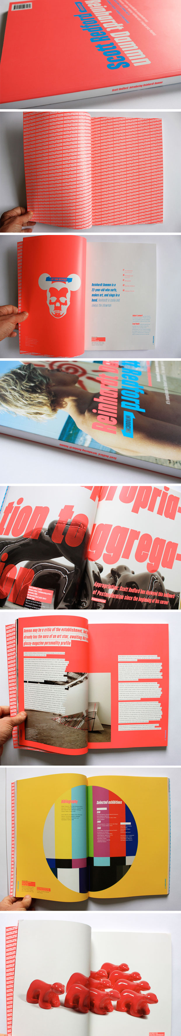
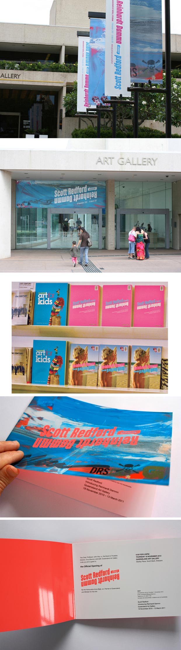
Scott Redford is one of Australia’s most distinctive contemporary artists: irreverent, intellectually sharp, and not afraid to push against the conventions of both art and design. When his major solo exhibition came to Queensland’s Gallery of Modern Art (GOMA), the visual identity needed to honour the work without competing with it.
I was tasked with creating the visual branding and exhibition catalogue art direction across the full rollout: typography, colour palette, gallery banners, advertising, and all printed materials. The challenge was to hold Redford’s distinctive artistic voice at the centre of the visitor experience while producing a cohesive, production-ready design system across multiple channels.
“The exhibition was a dialogue on Redford’s work with an imaginary character named Reinhardt Dammn.”
My Role
I worked directly with Scott Redford throughout the project, which was as much a creative collaboration as a production brief. My responsibilities included:
- Developing the typography, colour palette, and overall visual language for the exhibition
- Art direction and design of all exhibition assets and the exhibition catalogue
- Managing production and printing processes end-to-end
- Overseeing proofing and editing across all materials
Result
Managing a multi-channel rollout for a major gallery exhibition is a rare opportunity, one that demands equal parts design precision and creative confidence. Working closely with an artist of Redford’s calibre, required a high standard that pushed this work to a new level.
The visual identity produced served the work: present enough to give the exhibition a coherent identity, restrained enough to keep Redford’s voice exactly where it belonged: front and centre.